Call Her Mommy
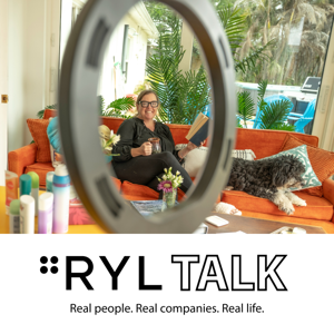
Meet Joce, 4RYL’s newest Curator, mom of three kids four and under, professional researcher of everything that enters her house, and the person who managed to record this entire episode while nursing a three-month-old.
Call Her Daddy? Around here its giving Mommy.
And considering Alex Cooper might be nursing a baby of her own on camera sometime soon, we feel like we’re just ahead of the curve.
In this episode, we get into what being a 4RYL Curator actually means and then promptly spiral into all the things that make trying to buy "better" completely exhausting. Deodorant. Mattresses. $40 baby shirts. Kids’ hair products. Toothbrushes. EWG. Yuka. And that special kind of rage you feel when the "clean" product you spent extra money on turns out to be not quite as clean as you thought.
Joce is postpartum. Christy is perimenopausal. So between the two of us, our hormones have apparently decided to approach life from opposite directions and meet somewhere in the middle to ruin our deodorant. It also means we’re shopping for completely different stages of life, which turns out to be a pretty great way to compare notes on what works, what doesn’t, and what suddenly stopped working because your body changed the rules without consulting you.
We also talk about the part that gets conveniently left out of a lot of these conversations: MONEY. Sure, we'd all love the perfect organic mattress, the beautiful non-toxic wardrobe, and the absolute best version of everything in our homes. We'd also like to pay our mortgages.
Because when Christy started looking at the existing "curator" space, she kept finding recommendations that didn't look anything like actual life. $300 dresses. Expensive must-haves. Beautiful people with beautiful homes casually linking things that would blow my budget before I made it through breakfast. Good for them, but where are the people who want better products and also have to look at the price tag?
That's the space we want 4RYL to fill.
Joce's philosophy is pretty simple: it doesn't have to be perfect. It needs to be better, actually work, and make sense for her family and her budget.
That's also exactly why 4RYL has Curators. We don't all have the same families, budgets, priorities, bodies, or reasons for buying something. We're going to disagree sometimes. GOOD.
No gatekeeping. No $300 dresses being casually tossed into a "must-have" list. No pretending real life has an unlimited wellness budget. Just real people trying things, doing the research, spending actual money, and reporting back.
And yes, there is breastfeeding during this episode.
Just Call her Mommy.