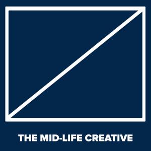
Cover artCover art is another area that adds up to the first impression a listener will have when looking for your show. Having clean, readable, attractive cover art will help your show stand out. I tend to use Photoshop to create my art, but many new podcasters may not have access to Photoshop, or they may not have the ability to create something by themselves. That’s ok. There are great social media graphic creators like Adobe Spark Post and Canva that have resources you can use, and there are places like Fiverr where you can outsource this to a creative pro.
Some technical specifications for cover art you should adhere to: The minimum size for podcast cover art is 1400 x 1400 pixels, in either JPG or PNG format, and shouldn’t be any larger than 500kb. Apple podcasts would like you to submit something closer to 3000 X 3000 pixels, so the larger you can make the art, the better. Remember to keep it under the 500kb limit, though.
As far as aesthetics, I would tell you that all the best logos are simple and require very little or no text. You know the Apple Logo when you see it, just like you know the Windows logo, Pepsi, or Walmart. They’re simple.
You certainly don’t have to go this route, but I’m a big fan of flat, clean, minimalist design, as you can see by the covers for my most recent shows. I was influenced to some degree by the covers designed by Relay.FM, which has a consistency of design between their shows.
It’s important to remember that listeners will view your art in a smaller format, so it needs to be readable. Don’t put a lot of detail into your art. It may end up just looking messy.


 View all episodes


 By Roley