Well, you're the designer...

Well, you're the designer...

By solopress.comBusinessArtsMarketingDesign
Download on the App Store

Well, you're the designer... episodes

  • S1 Ep10: Roundup Pt. 2 - Frustratingly Vague

    This week is part 2 of our round-up where we bang through a bumper collection of clangers. Last time we spoke about “super specific requests” and this week we’re onto the “frustratingly vague” ones:

    • “I need it to be elegance and classy”
    • “keep everything from my example but also do it differently”
    • “Jazz it up”
    • “Just play around with it”
    • “I like blue/red/green (there are endless types and shades or each colour)”
    • “Just a quick task for you…”

    • 34 min
    • S1 Ep9: Roundup Pt. 1 - A super specific smörgåsbord

      Season 1 of “Well, you’re the designer” is nearing the end. To round things off, we've swept up all the leftover morsels into an appetising two-part buffet of baffling briefs and frustrating feedback. We’ve split the resulting smörgåsbord into “super specific” and “frustratingly vague.” This week it’s the turn of the “super specific” requests, so we’re discussing:

      • “Please include this small pointless map”
      • “Replace this picture with one of the opposite orientation”
      • “Use this terrible font combination”
      • “Bullet points only”
      • “Use my grotty, badly-framed images over good quality stock photos”
      • “Use the international phone number format”
      • Listen to the end to see how Matt and Rich score each client clanger.


        34 min
      • S1 Ep8: Can you fill up all that empty space?
        To the untrained eye, empty space around text and graphics can feel like unused real estate, or a missed opportunity to make everything bigger. But empty space is not wasted space. It can be an effective means to highlight a strong message by allowing the eye to identify it quickly and dwell on its meaning. Our designers explain how giving each element room to breathe can create a greater impact than packing the page with content.
        38 min
      • S1 Ep6: Just take the content from our website!
        A client’s website is their castle. They use it to store everything they might think of as a brand asset. So when it comes to designing something new, all the building blocks are there, right? Well, most often they’re not. Content must be appropriate to the medium, whether that’s the size, orientation and format of images, or the brevity and intent of the copy. We look at why it can be unhelpful for everyone involved to “see website for details.”
        29 min
      • S1 Ep5: Let me show the team and get back to you...
        Design by committee. Every designer's nightmare. Collaboration is cool but excessive input can dilute strong ideas and imperil the process. So why are clients still enlisting the aid of partners, parents and pets in their decision making? Our designers discuss how to navigate the dinghy of design when everyone's sticking their oar in.
        46 min
      • S1 Ep4: Make it pop!
        What do we think of the design, guys? Everyone’s input is valuable. No wrong answers. “Make it pop!” you say…  What does this oft-spouted piece of vagueness actually mean? Is it even possible to pop amid an all-out war for our attention, where we’re constantly popped at from all angles?
        46 min
      • S1 Ep3: Faded background image with centralised text
        Grab a photo. Fade it out so it’s no longer impactful, but leave just enough detail to interfere with the text. Centre-justify the text so it’s basically an assault course for your eyes. The classics are classic for a reason, except when they’re horrible. Turns out this is a commonly requested design. Who knew?
        Brought to you by solopress.com - print delivered tomorrow.
        32 min
      • S1 Ep2: Show me a few versions…
        Requesting multiple designs might sound like a great way to get some different options to ponder over. That’s until things get out of hand. The boys trade anecdotes about how analysis paralysis ruined a couple of brands before they even had a chance to trade.
        Brought to you by solopress.com - print delivered tomorrow.
        36 min
      • S1 Ep1: Make the logo bigger
        Massive logo - no brainer, right? Everyone wants to push their brand to the fore, and a prominent logo seems like a quick win. So why are graphic designers reluctant to comply? We have a look at the consequences, both aesthetic and commercial, of going large with the logo.
        Brought to you by solopress.com - print delivered tomorrow.
        42 min

      About Well, you're the designer...

      From the publisher's feed

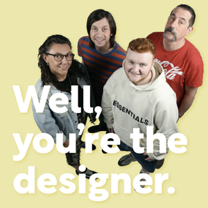
      Step into the exhilarating world of graphic design with series 2 of 'Well, You're the Designer.' Join Richard Kemp, Ellise Collins, and Oscar Jackson as they navigate the highs and lows, the breakthroughs and setbacks, the inspiration and perspiration shaping a designer’s life.