
Sign up to save your podcasts
Or

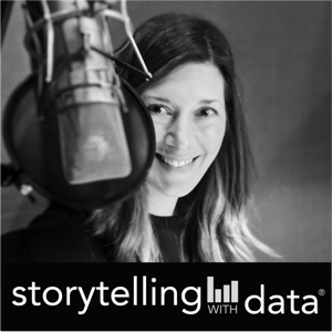


Join data storyteller Alli Torban as she shares a very common slide title mistake: using questions as your slide titles. You'll learn why question-based titles can divide your audience's attention, how to write a better title, and a simple bonus tip for making both your slide titles and chart titles work together. It's a small change that can make your presentations much easier to understand.
Show notes: https://www.storytellingwithdata.com/podcast/104
RESOURCES MENTIONED:
Simon Rowe's blog post: "be careful using questions as slide titles"
Alex Velez's blog post: "transforming slide titles"
Watch our AI virtual event recording on YouTube
Learn about our Enhance with AI team training
Use code PODCAST10 for 10% off our public workshops and on-demand courses
Do you have to be a designer to create better visuals?
Join data storytellers Alex Velez and Alli Torban as they share practical ways to train your design eye by studying great examples, recreating charts, and seeking feedback—all while making intentional design decisions that help your audience understand your message faster. If you've ever thought, "I'm just not a designer," this episode will show you where to begin.
Show notes: https://www.storytellingwithdata.com/podcast/103https://www.storytellingwithdata.com/podcast/103
RESOURCES MENTIONED:
Cole’s blog post “can design be taught?”
Join the SWD community
Presenting Data Effectively by Stephanie Evergreen
Chart Spark by Alli Torban (X-RAY technique)
Watch our AI virtual event recording
Register for the 4-hour, public workshop on August 20th, 2026
Use code PODCAST10 for 10% off!
Can "nothing changed" still be a compelling data story?
Join data storyteller Alli Torban as she shares why "everything is performing as expected" can still be a meaningful data story. Through three examples from the storytelling with data community, you'll learn practical techniques for making "normal" meaningful by establishing expectations, adding helpful context, and giving your audience confidence to make a decision—even when there isn't a dramatic insight hiding in the data.
LINKS
Show notes
The storytelling with data book
Join the SWD community
Steven’s submission
Robyn’s submission
Gian’s submission
Watch our free AI virtual event LIVE on July 13th, 2026
Register for the 4-hour, public workshop on August 20th, 2026
How do you teach data storytelling—and how does that change across disciplines, audiences, and experience levels?
Join data storyteller Amy Esselman and members of the storytelling with data university instructor community as they discuss how they help students move beyond analyzing data to communicating it clearly. You'll hear practical teaching strategies, including hands-on critique, real-world datasets, audience-centered assignments, and thoughtful conversations about the role of AI in the classroom.
Whether you're an educator, trainer, team leader, or aspiring practitioner, you'll come away with ideas for helping yourself and others turn analysis into understanding—and understanding into action.
RELATED RESOURCES
SWD instructor resource hub
Big Idea worksheet
Featured guests:
Francisco Cruzado Perni
Lisa Carlson
Simon Condliff
Elizabeth Ricks
Joel Dunahoe
Register for our virtual live event on July 13th, 2026! AI for data storytelling: better graphs, slides, and presentations
In this special 100th episode, the storytelling with data team looks back at our favorite podcast moments and shares the episodes we'd recommend depending on where you are in your data storytelling journey.
Whether you're learning the fundamentals, trying to create more compelling stories, thinking more strategically, influencing stakeholders, or presenting with confidence, we've curated special playlists to help you find the right episodes faster.
Along the way, you'll hear memorable clips, practical lessons that have stuck with us over the years, and the moments that changed how we think about communicating with data.
If you're new to the podcast, this episode is the perfect place to start. If you've been with us for all 100 episodes, you'll discover hidden gems worth revisiting.
Cole and new SWD teammate Alli talk about how to get more comfortable receiving feedback—even if you’re sensitive to critique. They explore how mindset shapes the way you hear feedback, why separating yourself from your work can unlock growth, and how building feedback into your process can help you improve faster. Along the way, they share personal stories—from Cole coaching a fourth-grade presentation to Alli’s early podcasting struggles—and how their own perspectives on feedback have evolved.
You’ll also hear practical tips for asking for better feedback and managing the tension that can come with critique. If you create and share ideas at work, this episode is for you. You don’t need thicker skin—you need a new perspective and a better process.
Related links:
In this episode of the storytelling with data podcast, Simon and Amy tackle common presentation challenges submitted by subscribers to the storytelling with data YouTube channel.
They discuss how to turn complex analysis into a clear and engaging story, why storyboarding can help you structure your message before jumping into slides, and how to decide what to include—and what to leave out—when your analysis contains more detail than your audience needs.
Simon and Amy also explore practical strategies for presenting dashboards, balancing graphs and tables, preparing for tough questions, connecting with your audience, and managing nerves. Along the way, they share personal presentation mishaps, hard-earned lessons, and concrete tips for building confidence, reducing filler words, and delivering with greater clarity.
Whether you’re presenting to executives, clients, colleagues, or classmates, this episode offers practical guidance to help you plan, create, and deliver more effective presentations.
Related resources:
Subscribe to the storytelling with data YouTube channel: https://www.youtube.com/@storytellingwithdata
Register for the May 14, 2026 virtual workshop: https://storytellingwithdata.com/workshops
Use code Podcast10 for 10% off
Book: storytelling with you: https://www.storytellingwithdata.com/books
Podcast episode 86: speak so others listen: https://www.storytellingwithdata.com/confidentcommunication
Podcast episode 46: the question of questions
In this episode of the storytelling with data podcast, Amy talks with Shahar Meir, a data executive with more than 20 years of experience leading data teams at companies including Meta and PayPal. Together, they explore what it really takes for data professionals to move beyond producing dashboards and reports to driving meaningful business outcomes.
Shahar shares why technology alone rarely solves an organization’s data challenges and outlines the four areas he sees mattering most: technology, people, process, and culture. He talks about trust in data, the importance of understanding your audience, and why the best data professionals learn to speak the language of the business rather than the language of tools.
You’ll also hear practical advice for individuals who want to increase their impact: how to better understand the business, how to frame data work in terms of outcomes, and why stepping outside your data silo can be one of the most valuable moves for your career. This is a rich conversation for anyone who wants their work with data to be more strategic, more influential, and more closely tied to real business value.
RELATED RESOURCES
Shachar’s LinkedIn | YouTube
Career unblocking mini-course: career-unblock.shacharmeir.com
$1M data professional presentation
How do you ensure your data visuals are consistently effective—and on brand? In this episode, SWD data storyteller, Simon Rowe chats with Maxine Graze, Senior Data Visualization Engineer at King, about the process of building data visualization style guides. They explore why “structure liberates,” how to balance aesthetics with usability, and why stakeholder feedback is critical. Whether you're designing for dashboards or decks, you'll walk away with ideas on how to bring clarity and consistency to your data storytelling.
Related Links:
datavizstyleguide.com – Explore open-source data visualization guidelines
Better Data Visualizations by Jonathan Schwabish – The book that sparked Maxine’s journey
Storytelling with Data Resources – Tools, tips, and templates from the SWD team
What if the numbers you work with every day weren’t as neutral as you thought?
In this episode, Mike is joined by Heather Krause, founder of We All Count and longtime quantitative researcher, to unpack a powerful concept: data equity. Together, they explore how every step of a data project—from survey design to chart choices—involves hidden decisions that impact what gets measured, who is represented, and what conclusions are drawn.
Heather shares the seven stages of the data equity framework, explains why choosing a denominator isn’t as simple as it seems, and offers practical ways to apply an equity lens to dashboards, visualizations, and more. Whether you're building a data product, making policy decisions, or designing a business presentation, this conversation will help you become more accurate, efficient, and intentional in how you generate and communicate evidence.
RELATED LINKS
Learn more at weallcount.com
Explore the Before & After audiobook → Listen here
From the publisher's feed

8,735 Listeners

388 Listeners

2,450 Listeners
476 Listeners

623 Listeners

582 Listeners

149 Listeners

305 Listeners

338 Listeners

155 Listeners
265 Listeners
9,069 Listeners

202 Listeners

814 Listeners
670 Listeners